From Red to Purple

I hope all of you guys had a wonderful Easter with your folks and loved ones around you!

I decided to give work a wee break for the Easter days and just spend some quality time with family and friends – and even though it’s still sad times because everyone misses my gran dearly we really did have a blast!

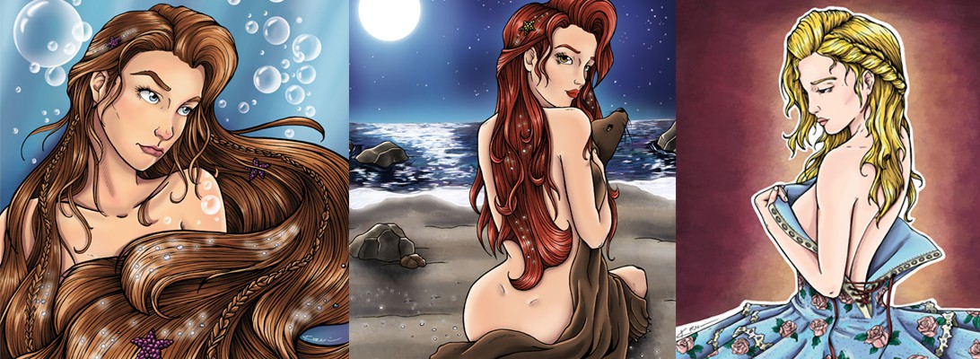
Besides, I kept working on the red dress piece that I posted a few days ago and it just wouldn’t get any better! I have rarely been that frustrated working on a piece – but hey – those pieces help you learn the most. After hours and hours of trying to get the red tones to match I quit the idea of using red at all (pah – that’s what you get for not working well, red!) and thus I changed the colours, played around for a while until I finally liked what I see.

Now that I am looking at both versions I think the purple/ blue-ish colours really do the trick. I actually always wanted to do something in those colours but never got around to do it.

london1700h-colourlondon1700-rgb-screen


I think it is quite funny how much the final version of an illustration can differ from the original concept. Since it was just a practise for myself there’s absolutely no harm done but in the past I also had clients who came up with ideas that wouldn’t work for anything in the world and I had many difficulties explaining why. What do you guys think? As always, please feel free to share your thoughts in the comments down below.

Next weeks is going to be busy since I’ll be working on two concepts for different projects and I still have a few commissions to finish. Stay tuned!

Colouring fashion stuff

I recently learned a different way to colour digitally and how to alter some Photoshop brushes so that they work much better for me. So I’ve been trying to use this new knowledge and it’s really going great so far. I’m working on a few pieces that are partly finished already but I want to post them as a whole series.

I’ve also picked up a few older line arts just for practise. I usually don’t like posting some of the work in progress colouring stuff but it won’t hurt to do it now, will it?

I’m not really happy with the way the skin looks and right now the colours don’t work that well together so there will be a couple of major changes for the final piece. I hope that I will get around to finish it sometime tomorrow but this one has taken me twice as much time as usual already.

london1700h-colourI hope you’re having a great Easter holiday!

Tentacles – sketch

The last couple of days were quite busy actually (given that I am back to work for only 2 weeks). I was working on the layout of a calendar all day even though I thought it would take me maybe just the half of it – but I’m done now which is grant.

Yesterday I tried to get the printer working for a solid hour because I wanted to get a print of the line art of the vulture girl sketch. Since I’m not really sure how to keep going on this one I figured it might be best to do a print, ink the print, see how it comes out and if it’s shit try something else. But since the printer wasn’t working I’ll have to try my luck again tomorrow.

Speaking of luck – something that definitely abandoned me. After finishing work I wanted to get as fast as possible back home to join band practise (one of my hobbies that I do practise on occasion). But instead of music I got a bus that was running late, locked doors leading to our band room and a phone that just died on me as I wanted to call my friends so that they’d open the door from the inside. As much as I dislike smartphones as much did I get fond of it – it’s so handy, like checking your mails while you’re on the go and all that art related stuff you can constantly take with you (instagram, pinterest, etc). Also I already noticed it’s absence when I wanted to take a picture of  today’s sketches to upload it here. Weeeell, no luck today.

So h10632392_836839573105503_2125732351_nere’s the last picture that I shared on my instagram account. I’m thinking about getting started with watercolours. I always loved the look of it but find myself having a hard time actually working with it. But if I don’t practise, I won’t improve ..

Also something different this time – no hair! Instead have looooads of tentacles ;)

I’ll make a scan of the coloured piece tomorrow and let you guys see how my little experiments turned out.

Stay fresh!


Game of Thrones – Cyvase Card Game

It’s almost Christmas (oh dear, how could that happen so fast again?!) and I am still stuck in bandages, tapes and a splint that keeps my right arm in fixed position. I had to realise that if you can’t use one hand (or in my case, both hands) you are very limited in doing things that are fun. Or productive, or both.

Thanks to my sister we now have Netflix but I have already lost count of the numbers of seasons and shows I’ve watched. Also I’ve been watching a lot of art shows and reading a lot about 3D animation programs. I really want to give it a shot once I am able to work again.

Trying to see the positive side of it, this way I actually am able to have a peaceful Christmas without any work. The workaholic within me is going crazy but there’s not much I can do. It will be so nice to have all my family together, spend time with each other and oh deary .. the food! I love my mom’s and grandmas’ food!

I’ve been working on an illustration for a project which was meant to launch in January but the makers decided that it would be a nice idea to start the campaign just before Christmas – so if any of you are in need of last-minute-present listen up!

I personally think that it is a brilliant and beautiful project. I am a great lover of the show Game of Thrones based on the books by G. R. R. Martin which is why I was hooked immediately after I saw the first pictures of the project.

The project is a strategy card game which is called “Cyvase“. The game is mentioned in both the show and the books and is played by various characters throughout the story. A Kickstarter campaign just launched and it’s already going really great! The rewards you can get if you back for it are really cool and if you love A Song of Ice and Fire you should check it out!

I was asked to create an alternative illustration for the card of the “red priestess”. You can get the illustration as a print as one of the rewards along with the game.

Also you can get the original line art – which is (since it is an original) one of a kind.

This is the link that will get you to the campaign (just go check it out – it never harmed anyone to have a look at something) kck.st/1Nqeulh.

And those are the images of the original line art and the fully coloured illustration!

cyvase-priestess-96ppicyvase-priestess

Trips and Art Nouveau

Hello my friends!

I know it’s been a while since I posted anything.

Unfortunately, I currently am forced to take a break from work because my wrist injury got worse and now I can barely move my right arm. I spend all the time that I actually am able to draw working off commissions I have already agreed to work on. Please, excuse the lack of new illustrations and sketches but I’ll try to come up with other cool stuff to fill my next posts.

Last week I was on a little business trip to Berlin. I’ve already been there a few years ago, but I never really liked that city. It’s just so big, dirty and crowded. However this time I absolutely loved it!

It still is very dirty and crowded but as I stayed in some kind of artist’s quarter there was also this amazing atmosphere. So vibrant and full of life!

Actually, I’m considering moving there – at least for the months in which I don’t have to attend uni. I met up with a few friends and had a few business meetings, one of them was pretty promising as I might have a job there already. But – we’ll see!

I dug up the line art of an illustration I did a few weeks ago. Still in love with the dresses and art nouveau!paris1900h-s

New Pencils

I finally was able to get hold of one of those extremely cool pencil I’ve other artists use. Actually it’s not that special, simply a blue pencil. But I got one of those mechanical pencils that have a blue lead. About two years ago I started experimenting a lot with differently manufactured pencils and I figured that this kind works the best for me.

So I got one and also adjusted my workflow – which means:

Instead of doing my sketches with a regular pencil and then having trouble erasing it after I went over it with my inks I just switched to doing a blue sketch, putting inks on it and deleting the blues digitally (thanks to good old Photoshop). I never dared doing that before because I thought working with the different colour channels seemed so hard but a friend gave me detailed instructions – it really wasn’t that hard.

I have been asked which pencils I usually use so I took a photograph of my essentials.

IMG_20151117_222355


As you can see it’s nothing special. For the sketch I switch between the blue pencil and regular pencils (3H & HB) and for my lineart I either use Copic Multi Liners or Faber-Castell PITT inks.

I picked up the idea of drawing pretty ladies in beautiful dresses. Since my uni is hosting a “1900 in Paris”-Party I came up with the idea of going back in time, exploring the fashion back then. I started with the 1700 London look (with the blues because I think it’s pretty!).

Hakuna Matata!

london1700h

Comic released!

Hello my friends!

After an incredible busy week in which I prepared my exhibition and the release of my comic book and the last couple of days in which I was at the exhibition I finally have some time to post something again.

To everyone who is waiting for a reply (be it a comment or an email) please give me another day – it was just very very much stuff going on and I’m trying to catch up on everything I missed to do as soon as possible.

The exhibition went really well and I got a lot of feedback from the people who got my comic. So far everyone really liked it and I guess I really do have to get started on #2 in the next couple of weeks! But first of all, I’ll translate it to English!

Uni really is quite a thing these days. It’s taking up huge parts of my time and right now I am really struggling to get all the work done. However it is a great exercise for the to juggle with all the work and focus on the most important parts. I do miss working on illustrations, concept arts and comics the entire day, though.

Speaking of illustrations! I know that I am very very late but I don’t want to wait another year. So here she is (for those of you who liked my Facebook page this one isn’t new):

halloween-2015


Digital Colours

I spent yesterday trying different ways of colouring and different styles but didn’t get to a result that I liked. Today, however I got things going for me!

Colouring digitally has always been one of the things I wanted to be able to do. A while back (and still) I would look at other artist’s works and be left in utter awe because it was just magnificent. So when I started i thought that it couldn’t be too hard. If you look at a finished illustration you see all those colours and they make perfectly sense. Yes, the shadow is blue because it just has to be. the highlight are yellowish instead of white because what other colour would possibly come to someone’s mind who’s got eyes?!

So I took one of my inked sketches, scanned it and opened it in Photoshop.

Three hours later I was done with the sketch, done with the painting and definitely done with the day, too. While I was laying in bed it bothered me so much how hard I failed that I couldn’t sleep for hours. The next day I went back to my computer and tried again. Same result, early bedtime. This went on for weeks and I started blaming my computer and my version of Photoshop – which was a pretty old one. It just felt easier that way.

I went back to colour my sketches and illustrations in the traditional way (markers, pencil, ballpoint pen) but now I suddenly sucked doing that too!

After hours and hours and hours and even more hours I finally started to get the hang of it (Thanks God!).

Art is probably the most disappointing thing I’ve done in my life. But also the most rewarding.

And by now I dare to say that my colouring has turned out to be quite okay.

One of the first fully coloured pages of my comic “Warden of Time”:

wardenoftime-page7-72dpi

Comics Looking Weird

I’ve spent the last days laying down the basic colours and getting more pages done.

It really looks like I’ll be able to finish this step tonight and start the proper colouring tomorrow.

Before I started working on “Warden of Time” I knew that making comics takes an incredible amount of time but dear Lord – I still underestimated it! But that’s why I loved making it even more. I’m a great friend of challenges. Especially working with tight deadlines gets me!

I split up the process in different steps and work my way from step to step instead of page to page. Some artists do that but I don’t really like it that much. It works with smaller projects like 4- 6 pages but definitely not with 30 +.

Here’s my list of completed (and coming) steps:

  1. Rough layout of the pages
  2. Pencil sketch
  3. Inking
  4. Flat layers
  5. Highlights & Shadows
  6. Lettering

I didn’t included the step of creating the characters. This took me a couple of years. But it doesn’t necessarily have to take that long. I was just playing with that story while I was still in school and developed the characters and the plot over the years.

But as you can see – it won’t take me much longer! I’m so excited! The exhibition will be in 5 weeks and by then I will have it finished!

I remember one teacher who was really … supporting when it came to being nice to his students. He promised me that I would never get anywhere in life. He got an invitation to the exhibition.

While I was checking for mistakes in my flat layer I temporarily hid the lineart (inks) layer and it turned out to be pretty weird-looking.A bit of another sneak peek here!

flats-003 flats-lines-003